Cash App Stock & ETF Search
UX microcopy & content design

Context
UX researchers noticed that customers were investing in the same stocks and ETFs. They also received feedback that the Investing search page was confusing. There were a lot of filter options that weren’t nested, and the page didn’t provide any guidance on investing basics. Many of our investing customers admitted they were new to investing and we getting lost with all our options. With the product manager and designer, we decided to revamp the search function and provide educational information.
What we did
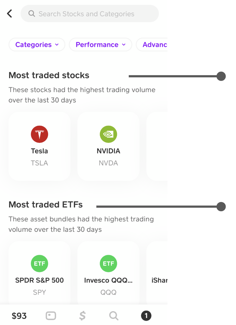
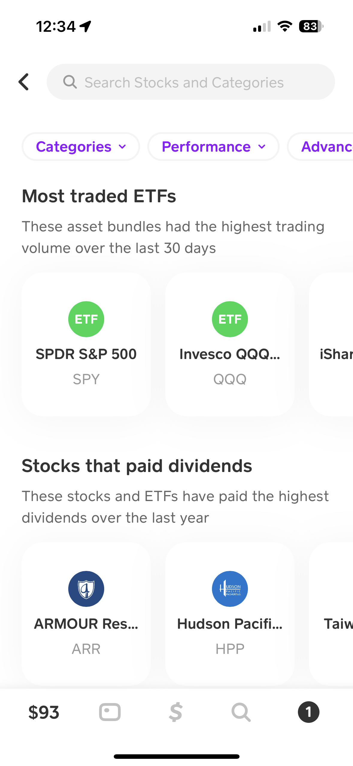
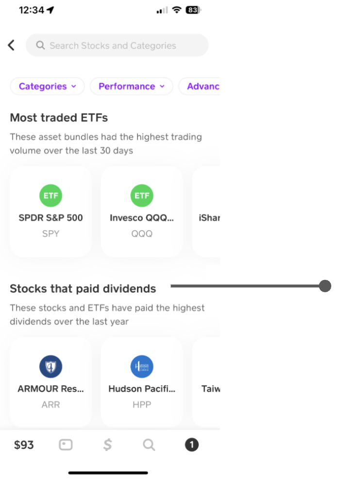
We splitting the search feature into three main categories that are industry standards: most traded stocks, most traded ETFs, and stocks that pay dividend. This gave customers a non-intimidating entry into investing
Wrote the sub-descriptions. These descriptions had to be under ~11 words while answering several questions:
“What do we need to describe?” vs. “What can we assume the customer already knows?”
What does “most traded” mean?
What is the time frame for these sections? a week? 30 days? a year?
What is an ETF? Does the term “asset bundle” work?
Do we need to define dividends?
We also discussed how the categories should be organized on the page. We chose “Most traded stocks” to be listed first, since customers told researchers they generally understood what stocks were compared to ETFs and dividends
We also reviewed previous customer search metrics and saw that: ETFs was a more common search term and Dividends had less customer engagement
We reviewed the previous search filters and ensured the search taxonomy for each search category still made sense. We ended up:
Making the stock performance filter include a wider range of dates it could include. We added a week (Wk), and a year filter
Combining, creating, and deleting certain category terms like ETFs and Business Services. We also allowed overlap between certain categories